How to make the perfect Grafana dashboard?
You may think that your dashboard is perfect but the next incident can completely break this perception.
First, there is no such thing as a perfect dashboard. You may think that your dashboard is perfect but the next incident can completely break this perception. This is normal, everything is imperfect in this world. We have to work with that. Improving dashboards is an iterative process. You have to make it a part of the culture in the same way as post mortems or other best practices for running services.
How to start
I always recommend starting with simple things. First, I’d like to recommend reading Grafana best practices articles1. There are lists of things that will help you formulate the overall high-level strategy. Don’t fill all the things at once - start slow. You can always add more metrics as you go.
It’s good to start with the first dashboard and basic things, such as absent metrics (to detect if your metrics are even working) and up/down metrics (are all instances of database healthy?).
Generally, it’s good not to forget about observability rules. I prefer The Four Golden Signals2. You can also use the USE method3 or RED method4.
Finally, add important business metrics that are relevant to your service (number of new registrations, outgoing emails, created teams or projects, etc.).
What to do next
Maintaining dashboards is not an easy task. Creating hundreds of dashboards is simple but maintaining them is a nightmare. How to prevent this? I recommend thinking about structure and using the drill-down strategy. Use tools, such as Jsonnet, to generate consistent dashboard over teams, environments and services. You will be able to reuse common parts, such as metrics for load balancers or databases used across the company.
What is a drill-down strategy? It means that you have a central dashboard with overview as a single point of contact for your oncall engineers and then there are more detailed dashboards linked from the central dashboard.
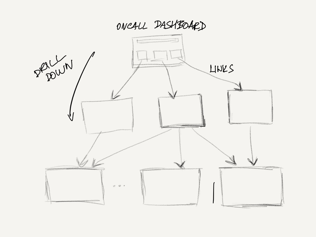
In this dashboard, they see the most important things. You need work to minimize the noise there and focus only on important signals.
You have to keep in mind that nobody is constantly looking at the dashboard (except the guys working in NOC). You have to think about it and make the visualization and error signaling significant to the person at 2am in the morning, after the pager woke them up. If a signal is visible, the operator can click on a graph and to get to another dashboard that gives more insight into the problem. This can be repeated for more levels of depth. Based on my experience, it is only useful to stick to a maximum of 2 to 4 levels of depth.
Dashboards should be using variables and templates. You can let the user switch between different variable values to display the relevant data for a data region, availability domain or a specific application.
Make templates for reusable components to make your setup DRY and easy to maintain, such as a common header for all your dashboards.
Links to detailed dashboards should also use variables and templates, to minimize the amount of code. For instance, you can reuse the same dashboard type for all your applications.
Make the process work!
Create a process to review the dashboards and include it in your regular operations review. You should iterate on improvements of metrics and dashboards, ideally on a weekly basis. The best way to do this review is to make it a part of your incident post-mortem process. You can use your incidents to inspire you to improve your alarms and margins for your dashboards.
Alarms have always a higher priority than your dashboards and you should focus on good alarms with actionable runbooks for solving issues.
Dashboards have to add more context and overview for your service. This helps with finding correlation with other events5. If you can, integrate the logs and traces into a single tool or add links between them to find what you need.
Take regular feedback from the team and operators to make it easy to make changes in alarms and maintain the dashboards.
for example deployments are displayed as annotations in Grafana, logs - Loki and traces - Opentracing/Tempo ↩︎